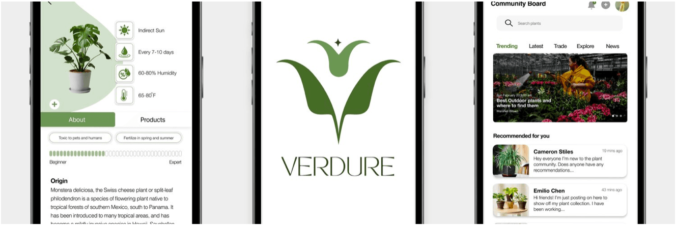
Verdure is a mobile application that allows users full access to plant health and management. Verdure helps users achieve their goals in plant maintenance and alleviate challenges and stress concerning plant care.
Verdure
Role:
UX/UI Designer, UXResearcher
Figma, Photoshop, Illustrator
5 months
Goal Directed Design
Tools:
Duration:
Method:
This project was done as a collaboration for the Interactive Design I class at Kennesaw State University. I collaborated in a team with four other classmates to create an app that allows plant owners to maintain, track and access plants health.We completed this project using the 5 phases of Goal-Directed Design Method.
Overview

Goal Directed Design Method
Research
During the research phase of our app the teams main focus was to understand the goals of the users of the app. Our team went through the 7 steps of the research phase including; the kickoff meeting, literature review, competitive audit, stakeholder interviews, SME interviews, and user interviews. Once our research phase was completed we complied all of our data into a research report. Below is a link to the full research report.
Getting Creative with Kickoff, Stakeholder, & SME Meetings
The kickoff meetings and stakeholder meetings are essential ways for the design team to understand what the stakeholders goals and wants are. Due to this project being a class project and not having stakeholders we were told to fill out a Kick-off meeting worksheet that allowed us to think from a stakeholders point of view. The worksheet overall helped our team understand the goal of the product, who the user of the app might be, the features that are most important in the app, and how we would beat our competitors.
Competitive Audit
Our team went on to evaluate existing plant apps to evaluate their user reviews, strengths, weaknesses, and the opportunities Verdure could take in order to make our app more marketable.
For our audit we looked at the apps; Vera, Planta, PictureThis,Blossom, and Plantin. After our evaluation of these apps our team came up with opportunities for our app:
Include a plant identification feature where the app identifies a plant and/or a disease
Include information section for each plant
Include a help section where a user can ask for tips, suggestion, etc
Make sure that our app is completely free and does not include a subscription or premium feature.
Literature Review
Our team went on to conduct a Literature Review to better understand and identify the patterns and trends within the plant maintenance domain. I worked on this portion of the research phase. To get a better understanding of the plant domain I researched plant community groups and boards within different social media domains such as Facebook, Quora, and Pinterest. I also looked at articles and websites geared towards plant care. While looking at these different community groups, articles, and websites I found a lot of factors that were important for us to consider when designing the app.Here are some of the factors that I found:
Access to knowledge
Many plant owners had limited knowledge on how to properly take care of plants therefore resulting in frustration over dying plants, and inaccurate information
This lets us know that most members within the plant community ask for a lot of help and suggestions for their plant maintenance and to consider that when designing.
Trends in plant ownership
Most plant owners were found to be millennials and younger gen-z due to an influx of plant trends due to social media and the COVID 2020 lockdown.
This let our team know who our demographic for this app will be and how to design the app to appeal to said demographic.
Lifestyle and Plant Maintenance
Most plant owners are working people in society and tend to have busy schedules resulting in many of them owning low maintenance plants.
This gave insight to our team about what type of plants are more popular among plant owners and how our app can fit within our users lives.
Overall this part of our research phase was very beneficial for us because it helped our team absorb as much context about our product and its audience in order to make the most appropriate decisions for our app.
User Interviews
To better understand our users and their goals we conducted 6 user interviews with plant owners who used and did not use plant apps. Each group member was a moderator of the interview while the rest of the team were notetakers. After each user interview, our team went over and discussed our notes. All the team members notes were discussed after each interview and grouped in an affinity map to find common points discussed.
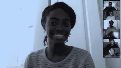
Moderating an Interview with my team and participant
Sample questions from the interviews:
How many plants do you currently attend to?
Have you used a plant app before ? What do you like and dislike about it?
How often do you water your plants ?
Have you ever had a plant die ?
How do you learn how to take care of your plants ?
What type of residence do you live in for example: apartment or house? Do you live alone or with roommates ?
When you purchase a plant do you go based on price point, aesthetic or maintenance?
Would having a community feature in the app be beneficial to you ?
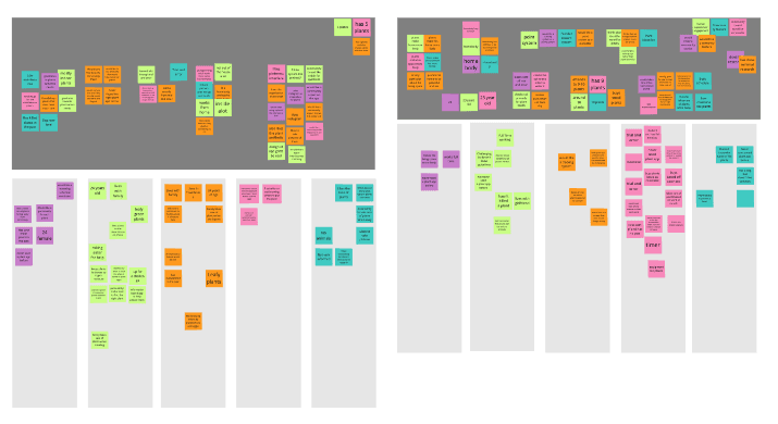
Affinity Mapping of Participant 1 & 2
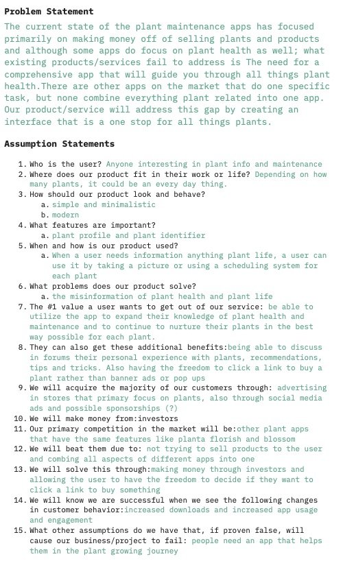
Kick-off Meeting Worksheet
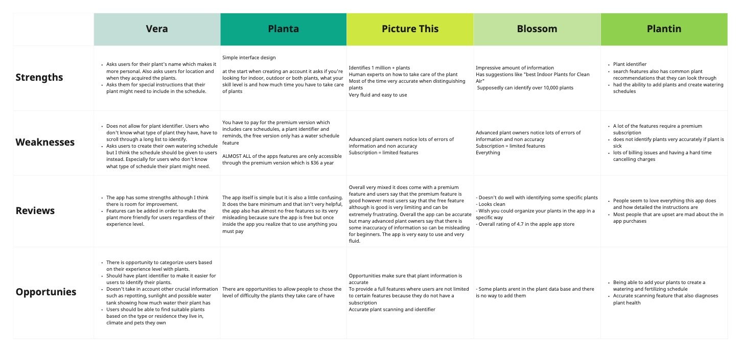
Competitive Audit Chart
Modeling
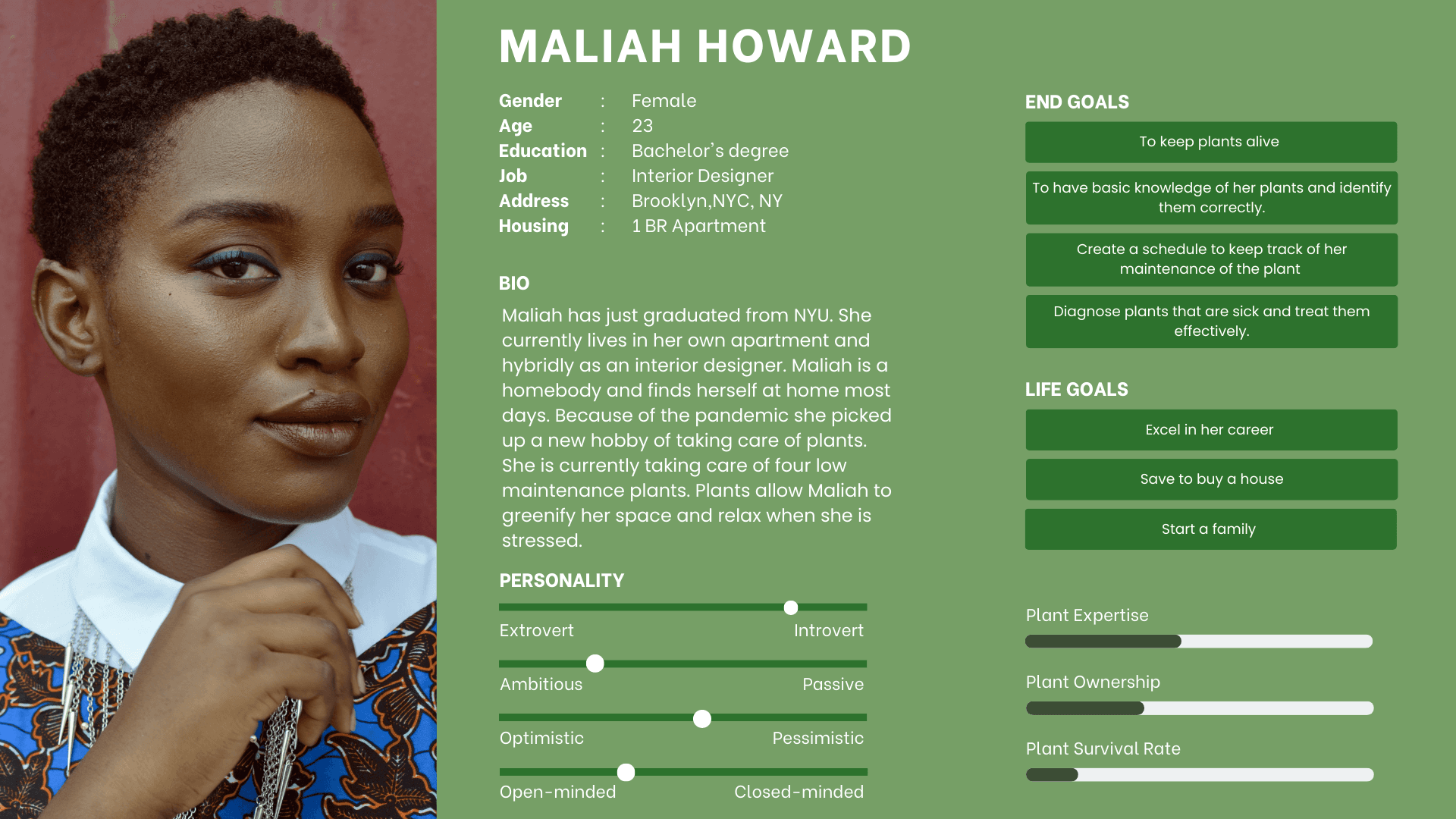
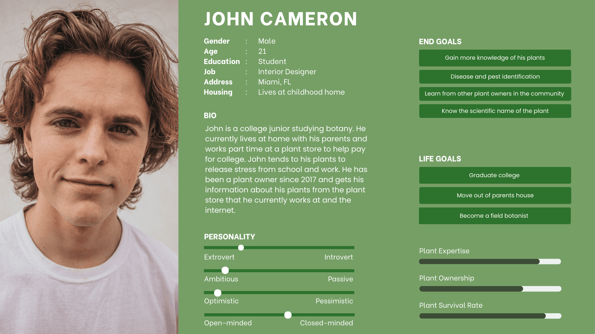
Our team went on to create personas create based on the behavioral variables discovered from the user interviews. The data revealed that we would have a primary and secondary persona based on experience level. The primary persona would be the beginner plant owner, and the secondary persona would be the expert plant owner.
Meet our Personas
Primary Persona
Secondary Persona
Requirements
Once we established our primary and secondary personas we created context scenarios for our primary persona. The scenario put our primary persona in a context where they would implement the app within their lives. Once we created our context scenario we were able to create requirements for the app.
Context Scenario
“Maliah recently brought a new plant but forgot the plant manual at the store. She doesn’t know the plant name so she takes the app to scan the plant and learns that it is a “Snake Plant (Sansevieria trifasciata)”. In the past she has mostly used trial and error to tend to her plants but wants to do better for them and watch them thrive. She follows all the information given from the app; watering, soil, fertilization, and other instructions She sets up the watering schedule in the app so that she can be reminded when to water her plant. She notices a few weeks later that the plant is wilting she goes on the app and ask the community board for tips, suggestions, and help on how to revive her plant.”
Requirements List
1.Homepage
2.Login Screen
3.Account Profile
4. Navigation Plant Profile
5.Plant Profile
6.Plant Identifier Information Page
7.Information Page
8.Community Board
9.Water Schedule/Calendar
10. Product Links
Frameworks
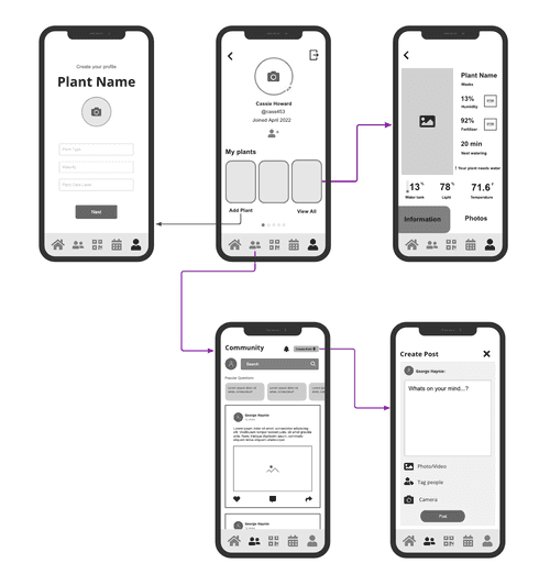
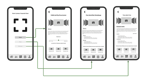
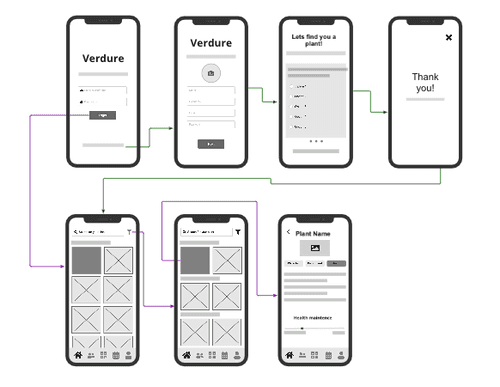
Once our requirements list was established we worked on the frameworks. We discussed the app layout ,functions of buttons and icons, and the interactive behaviors that would be included. In our wireframes we mapped out key path scenarios (more significant interaction paths that a user will use ) indicated by the purple arrows. Then we mapped out validation scenarios ( a second option interaction path the user might take) indicated by the green arrows.
High Fidelity Prototype
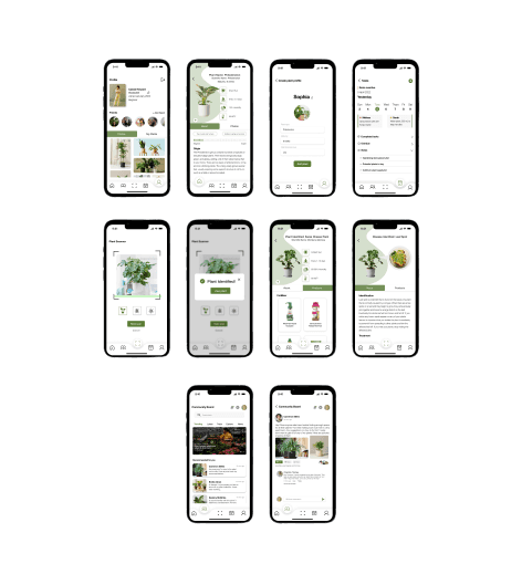
Once we finished our wireframes we created our high fidelity prototype.
Refinement
Once our high-fidelity prototype was completed we conducted usability test. Testing the product on users gave our team great insight on what needed to be fixed or removed from the final product. Our team conducted 6 usability test using a task list for the tester to complete task. Once the testing was completed the user was asked to complete a survey that gave feedback to our team.
Our overall feedback was very positive most users stated that they loved the:
Aesthetic of the app
Simplicity and seamless usability
Appreciate the community feature
We did have to refine our prototype because a lot of users found that some screens were not flowing correctly, some buttons were glitching or not responding and interacting correctly. Once our team took note of these things we went back in and fixed any interaction problems and completed our final prototype.
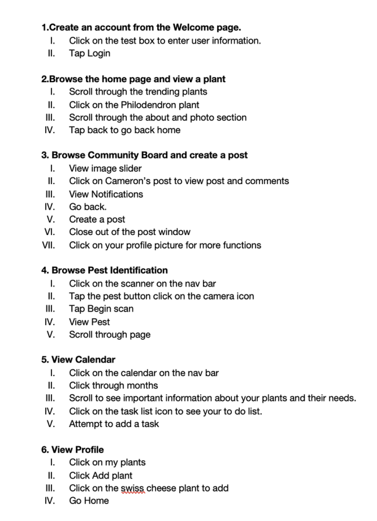
Usability Testing Task List
Lessons and Takeaways
Our team did an amazing job executing and producing a user centered app through the GDD method. I will for future projects consider:
prioritizing usability first and then aesthetics after in order to meet deadlines and work efficiently when prototyping
interviewing participants from a wide range of demographics in order to get different perspectives.
This project helped me grow as a designer, and researcher. I feel confident to continue to grow and work in more team projects to create user friendly products.
