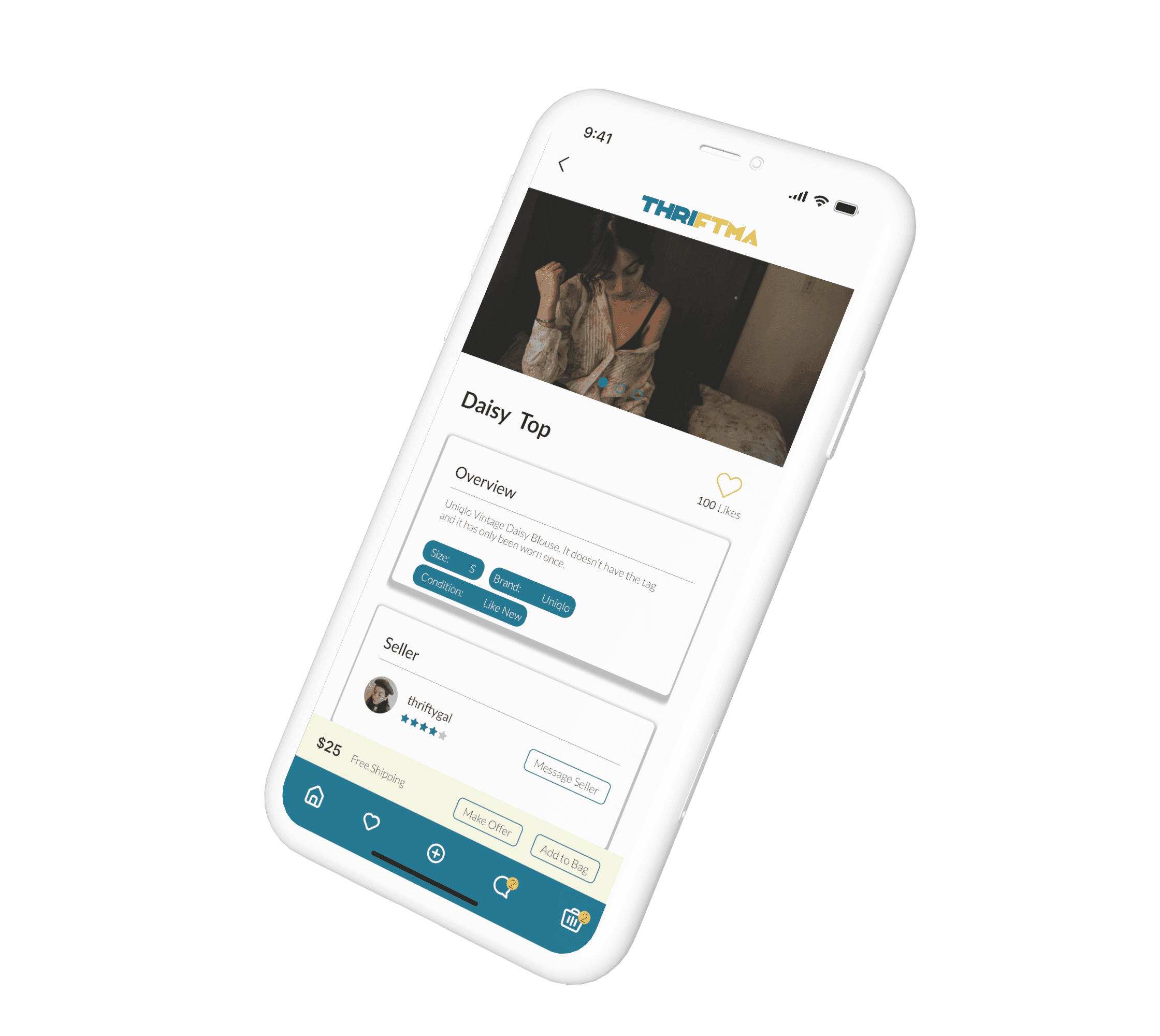
Thriftma is a mobile application designed to let users sell and donate used items ranging from clothes to electronics through the comfort of their phone.
Thriftma
View Prototype
Role:
UX/UI Designer
Figma, Photoshop, Illustrator
5 months
Tools:
Duration:
This project started in Spring 2022 in my Advanced Prototyping Class for my Interactive Design Major. This was a solo project and was part of our final project to showcase the skills we learned in the class for the semester. Unlike most high fidelity projects there was no use of a specific design process, although some phases in GDD were a guide in completing this project.
Overview
Style Guide
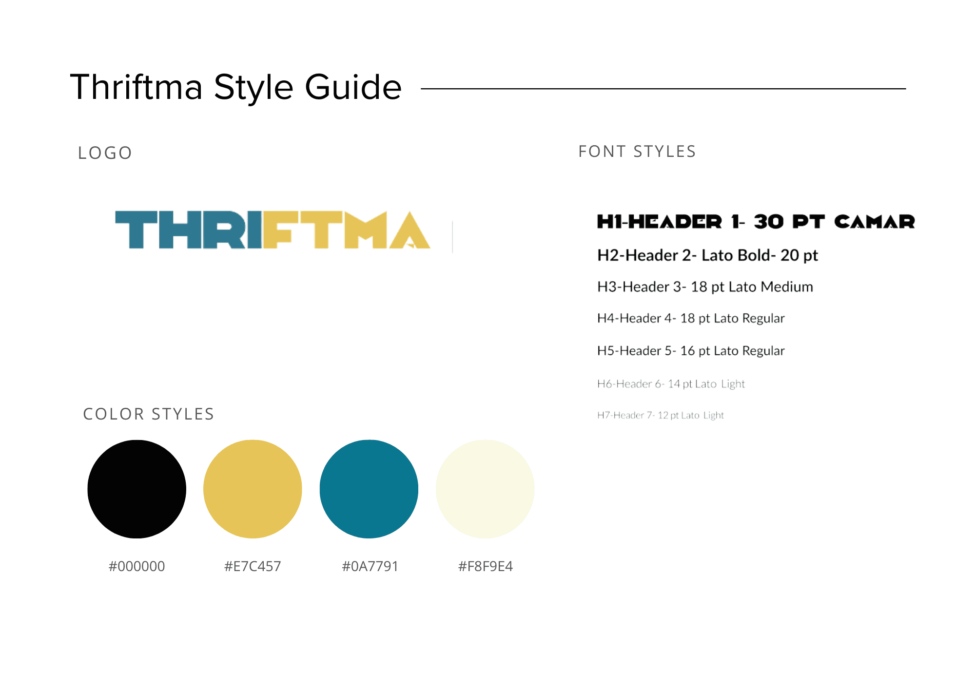
The first thing I did when designing my app was creating a Style Guide in order to maintain a clear and consistent format throughout my prototype.Overall I knew that I wanted look of my design to look vintage and fun but also simple and organized. Thus I went with fun vibrant colors for a vintage aesthetic and a simple sans serif font that could be used in different weights to distinguish content easily.
Auto Layout
For this project there was a mandatory use of auto layout. Auto layout is used to create designs that grow to fill or shrink to fit, and reflow as their contents change.Auto layout was mostly used for the components and frames created for this project. Most of the components in my project were buttons, cards, and icons.Overall Auto Layout helped a lot in saving time in the design process because many components were just adjusted or resized to fit the frame they were in.
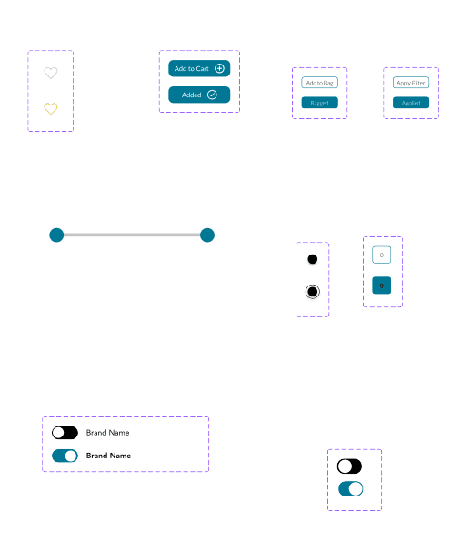
Components that utilized auto layout
Redlining
After I completed the prototype I performed redlining to indicate the spacing and sizing of my design in order to correct space and margins. This helped me tremendously on improving the alignment for the prototype and keeping all the elements consistent so that the design itself is easy for a potential user to use.
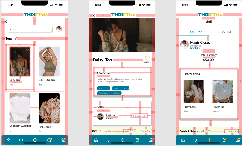
Redlining of the prototype
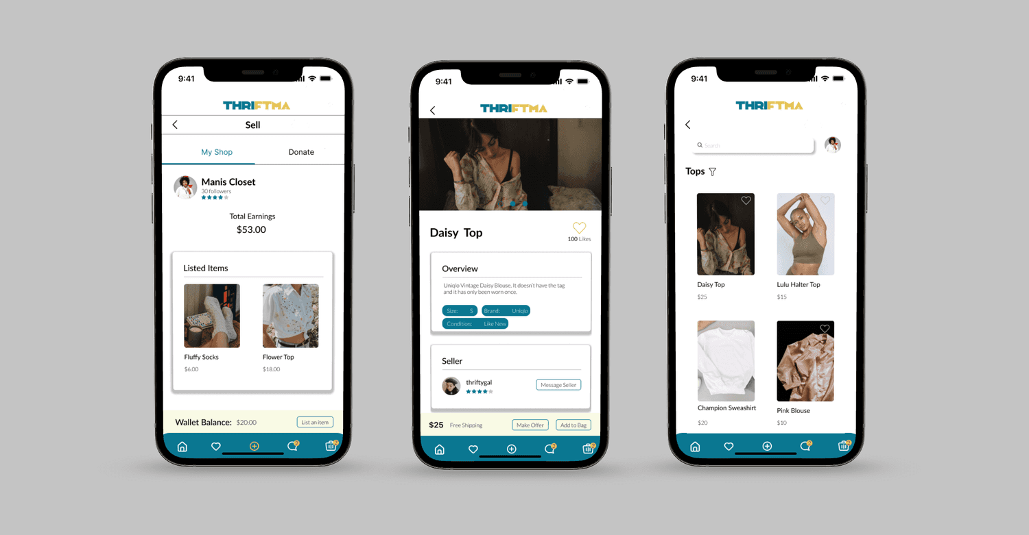
Final Screens
Lessons and Takeaways
This project was a great way for me to sharpen and expand on my prototyping skills, and UI skills. However there were some places I could have improved on and done differently:
utilizing a miniature research phase through competitive auditing, and research the secondhand e-commerce domain in order to understand the users goals.
utilizing more components and auto layout to make my design process go quicker and allow my design to be consistent.