RideX is a mobile app that prioritizes community it allows users to build relationships and find events in their community while offering and receiving rideshare
RideX
View Prototype
Role:
UX/UI Designer, UXResearcher
Figma, Photoshop, Illustrator
5 months
Goal Directed Design
Tools:
Duration:
Method:
This project was done as a collaboration for the Senior Portfolio Capstone class at Kennesaw State University. I collaborated in a team with three other classmates to create an app that allows users to particpate in rideshare while building community and friendships. We completed this project using the 5 phases of Goal-Directed Design Method.
Overview

Goal Directed Design Method
What is Goal Directed Design
Goal Directed Design also known as GDD derives from Alan Cooper it is the process that results in creating effective human centered design products.. In this methodology designers have to understand and keep users goals as the priority throughout the design process. This approach helps designers find a clear distinction between goals and task.s through the 5 phases of GDD; research, modeling, requirements, frameworks, and refinement.
Research
As designers the research phase is important to collect a wide range of research data to truly understand the user and their goals. The GDD Research phase consist of 7 steps; the kickoff meeting, literature review, competitive audit, stakeholder interviews, SME interviews, and user interviews. Due to this project being for a class project our team could not perform all of the steps of the research phase such as stakeholder, and SME interviews. However the RideX team made sure to go through most of the steps of the research phase in order to understand who the RideX user is and what their goals are.
Kickoff Meeting Alternative
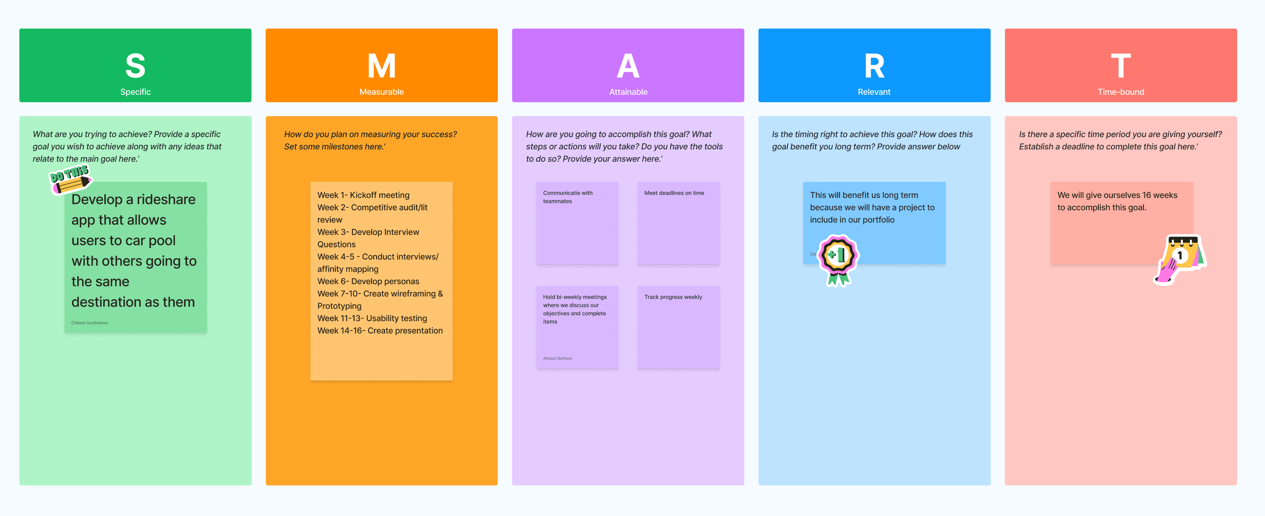
The kickoff meetings and stakeholder meetings are essential ways for the design team to understand what the stakeholders goals and wants are. Due to this project being a class project and not having stakeholders we were meet as a team to discuss our SMART GOALS. Smart Goals allowed are team to explore what our goals for the app were through finding the Specific, Measurable, Achievable, and Time bound aspects of the goal of RideX.
Competitive Audit
Once we established our goals for app we went on to conduct a Competitive Audit. A competitive audit allows designers to examine existing competitors and domains to see what users of those products believe they do well, poorly, and what they would like differently in order to gather data for user interview questions. For our audit we examined apps such as Uber, Lyft and Bumble.
Opportunities for RideX
Once we completed our evaluation of each competitor, we found several opportunities that our app could make to improve user experience:
Make the app more accessible for all users and let the user be in control of their experience
Improve safety through detailed background checks, and reporting and rating features
Make ride-share more cost affordable for users
Eliminate fees such as cancellation and gas fees
Lessen premium features
User Interviews
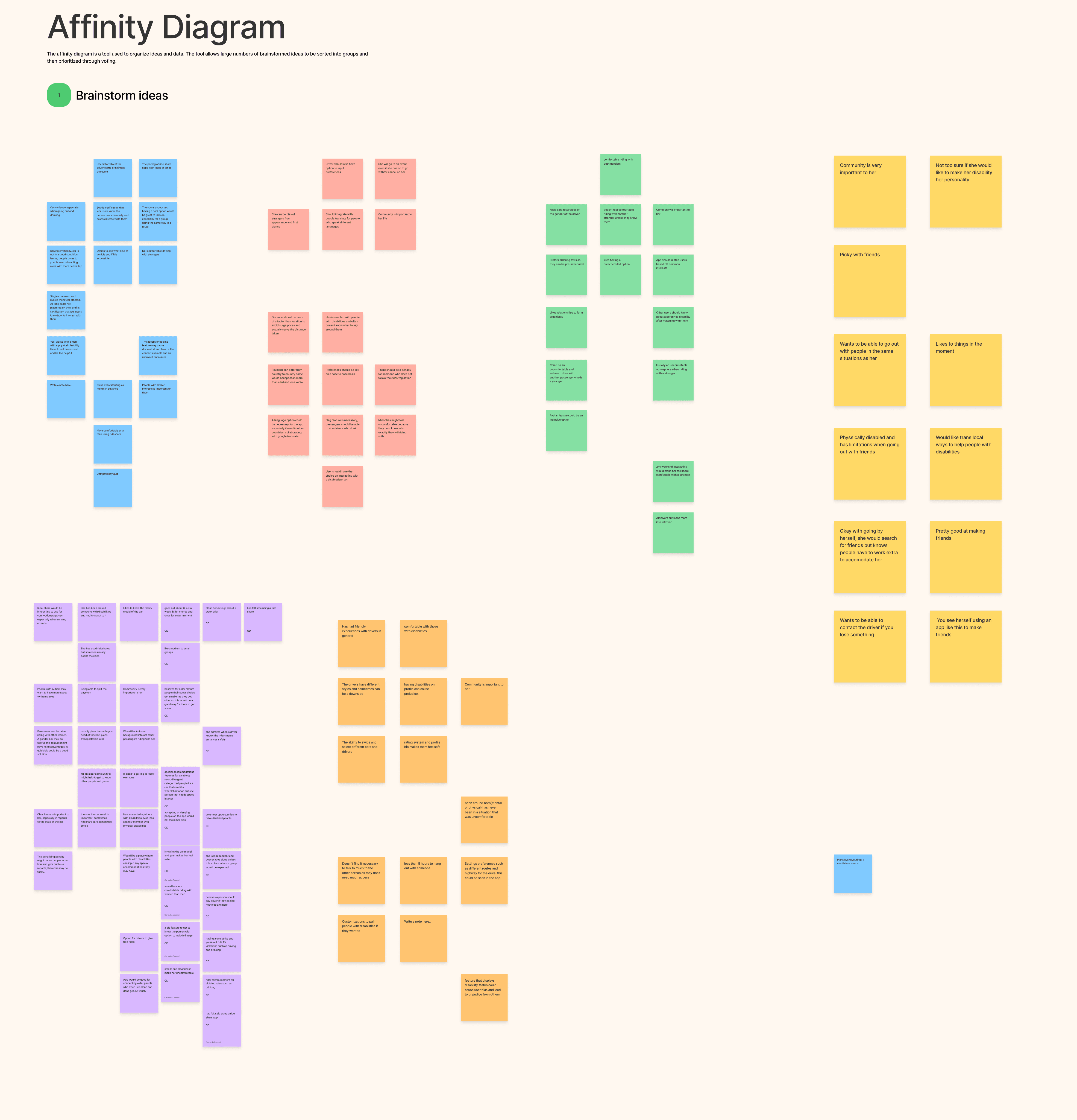
To better understand our users and their goals we conducted 5 user interviews. Due to our broad target demographic to find our participants we used Survey Monkey to find participants ranging from ages 18-70 years old.Once our participants were selected we created our interview questions and conducted the interviews over zoom. Each group member was a moderator of at least one interview while the rest of the team were notetakers. After each user interview, our team went over and discussed our notes. and grouped in an affinity map. Affinity mapping is when one takes all the data gathered from the user and groups the data by similar categories. This helps aid in finding users goals, themes, pain points to aid in the design process.
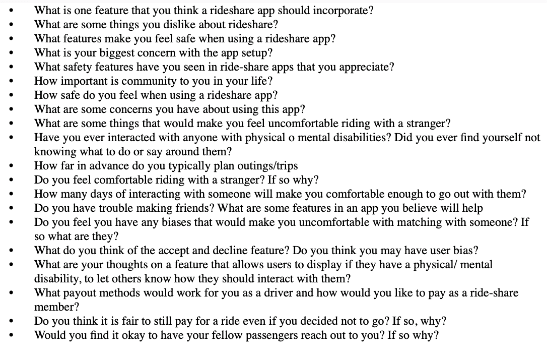
Interview Questions
Affinity Map
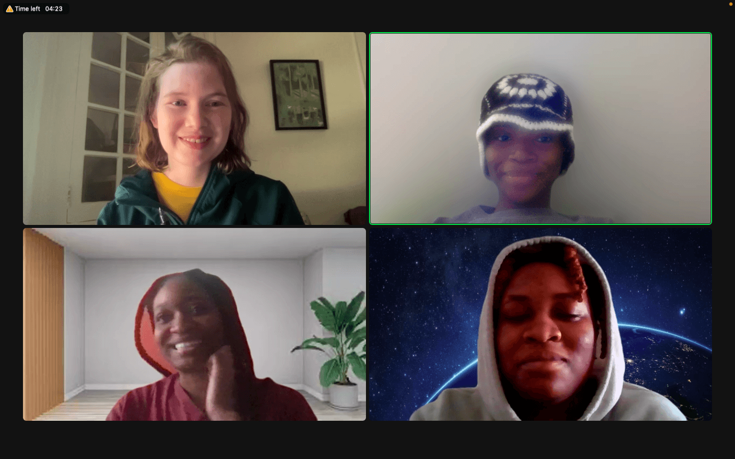
Moderating an interview with my team and particpant
User Interview Findings
Once all our data was evaluated from our user interviews we found that ride share user prioritize
Safety
Easy payments/multiple payment options and protection fees
Safe communication with passengers, riders and available accommodations
Access to map and routes
Rider and driver ratings
Access to community
Availability to switch from driver to rider and vice versa with ease
Language options.
SMART Goals Chart
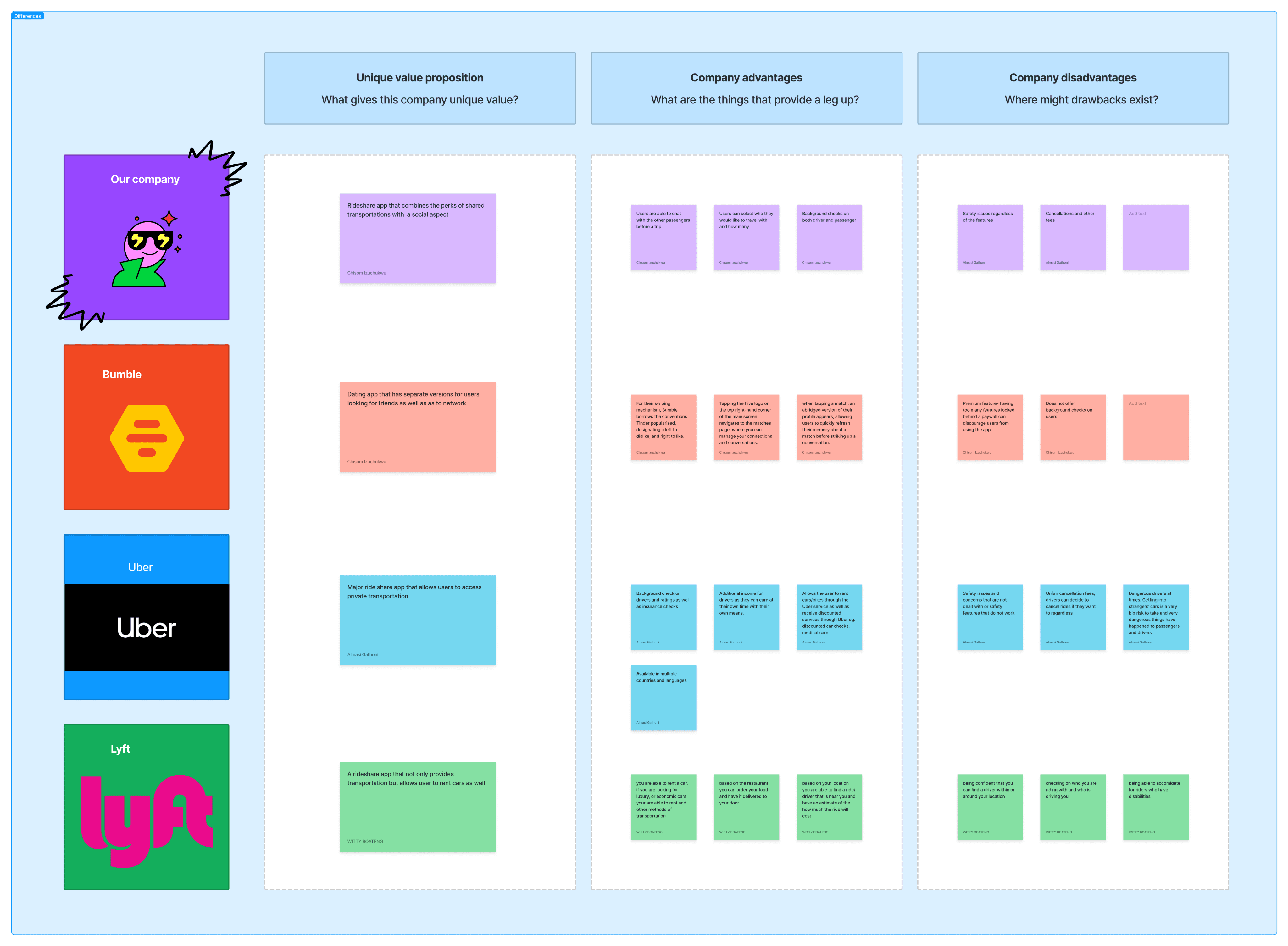
Competitive Audit
Modeling
After our research was completed we moved on to the modeling phase. In this phase we bridged the gap between the data found to create user models through the use of personas to indentify our user. Personas are fictional characters created based on research that represents a group of users who share common goals, needs, and behaviors. Our team went on to create two personas based on our findings: William Sorrento, an elderly widower seeking community and convenient transportation within his hometown, and Maya Rodriguez a young teacher new to the area, in search of an effortless means of generating additional income, discovering the city, and socializing with new acquaintances.
Once our personas were created to understand our user further and emphasize with them we decided to create journey maps for each persona. A journey map is a visualization of the process that an user goes through in order to achieve their goal.
Journey Mapping
Meet The Personas
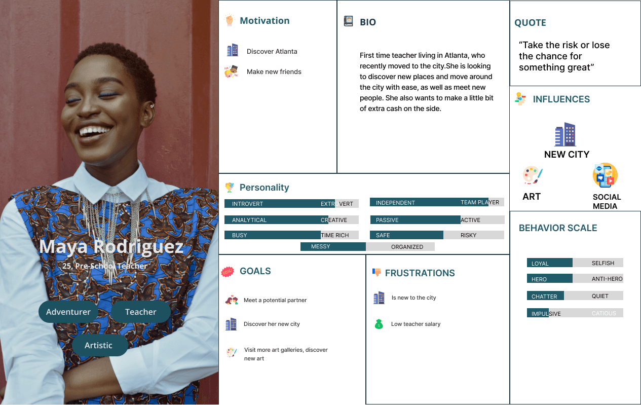
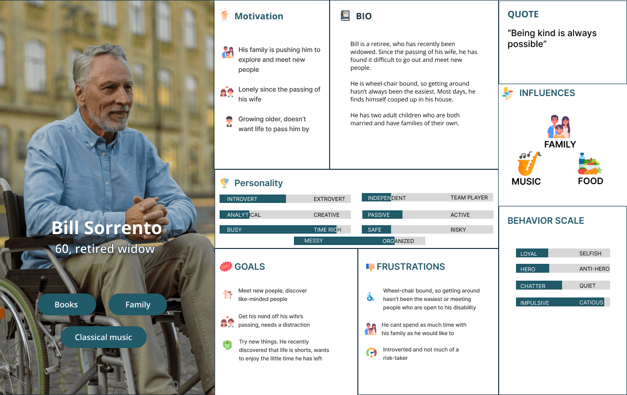
Persona 1
Persona 2
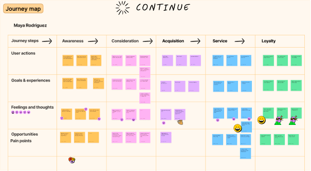
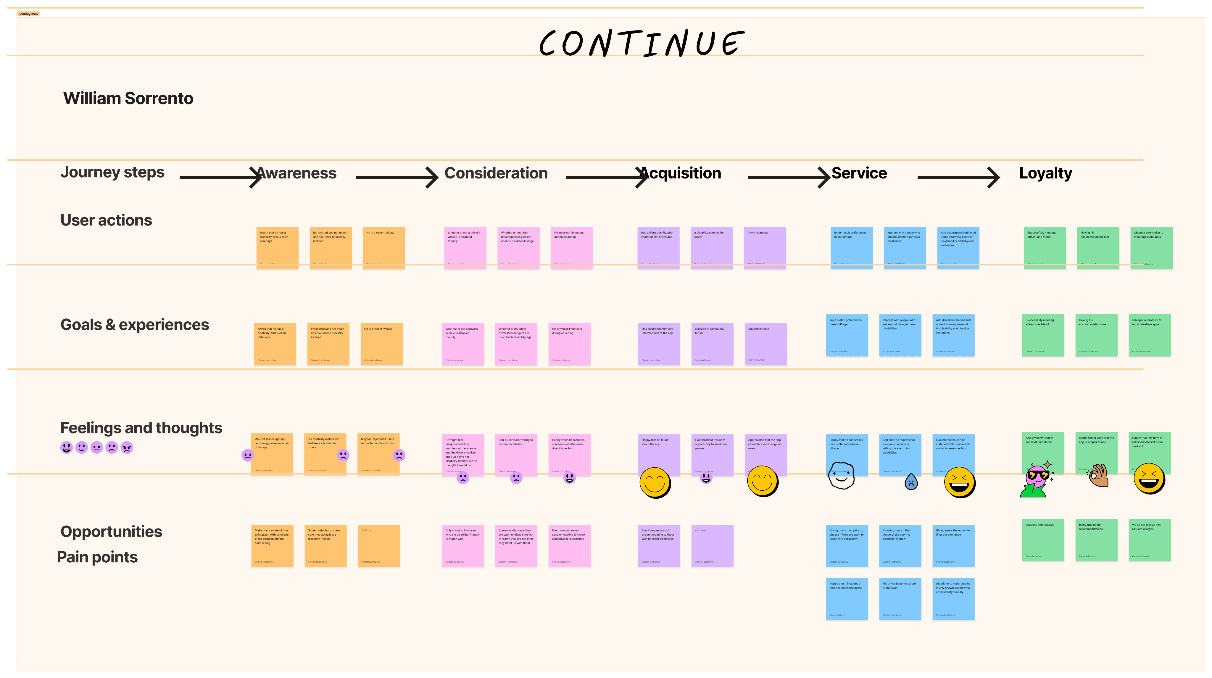
Persona 1 Journey Map
Persona 2 Journey Map
Requirements
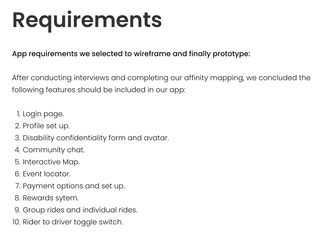
Once we established our personas we created requirements based off our personas. Requirements are the things such as functions, buttons, features that need to exist in the product in order for the persona to achieve their goals.
Requirements List
Frameworks
Once our requirements list was established we moved on to the Frameworks phase. In this phase it allow designers to create the overall structure of the users’ experience through the arrangement of functional elements on the screen, work flows, interactive behaviors, visual language, and more. As a team we took our requirements to create the app wireframe and later using the wireframe to create our high fidelity prototype.
Key Features
Accessibility for the Disabled Community
Community Feature
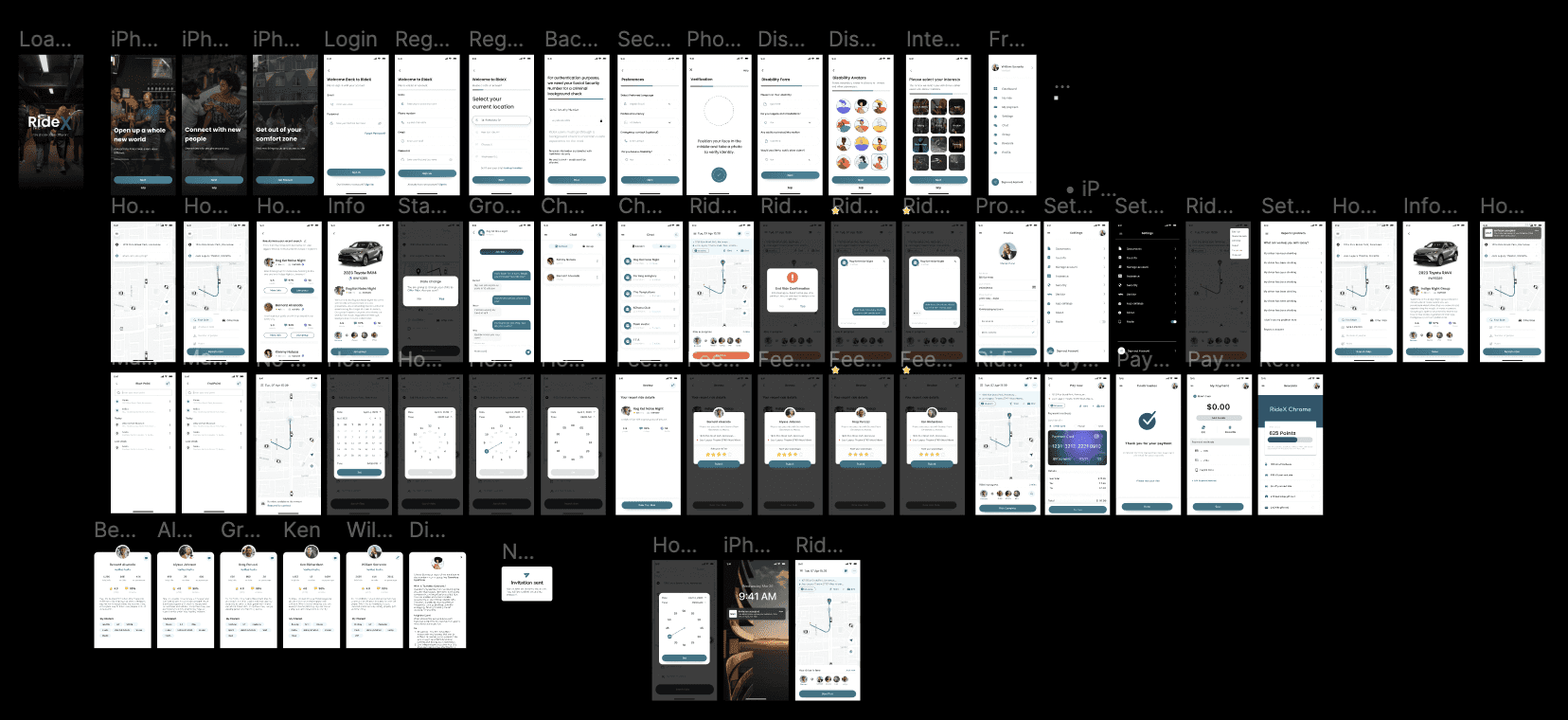
Wireframes
High Fidelity Prototype

Due to our incorporating a social aspect and gearing to be more inclusive within the rideshare industry. We had distinct features that achieve these goals for users to build community and for accessibility to be a priority
Inclusivity for all users was one of the main goals for our app, particularly for riders with physical and mental disabilities. Often times people with disabilities mental or physical are overlooked when creating apps or products and we wanted to ensure that the app was accessible and inclusive to the community in order for that marginalized group to have the safest and best experience possible.
Another component that makes RideX different from other ride-sharing apps was the social aspect of an user building community and relationships while participating in ride-share.
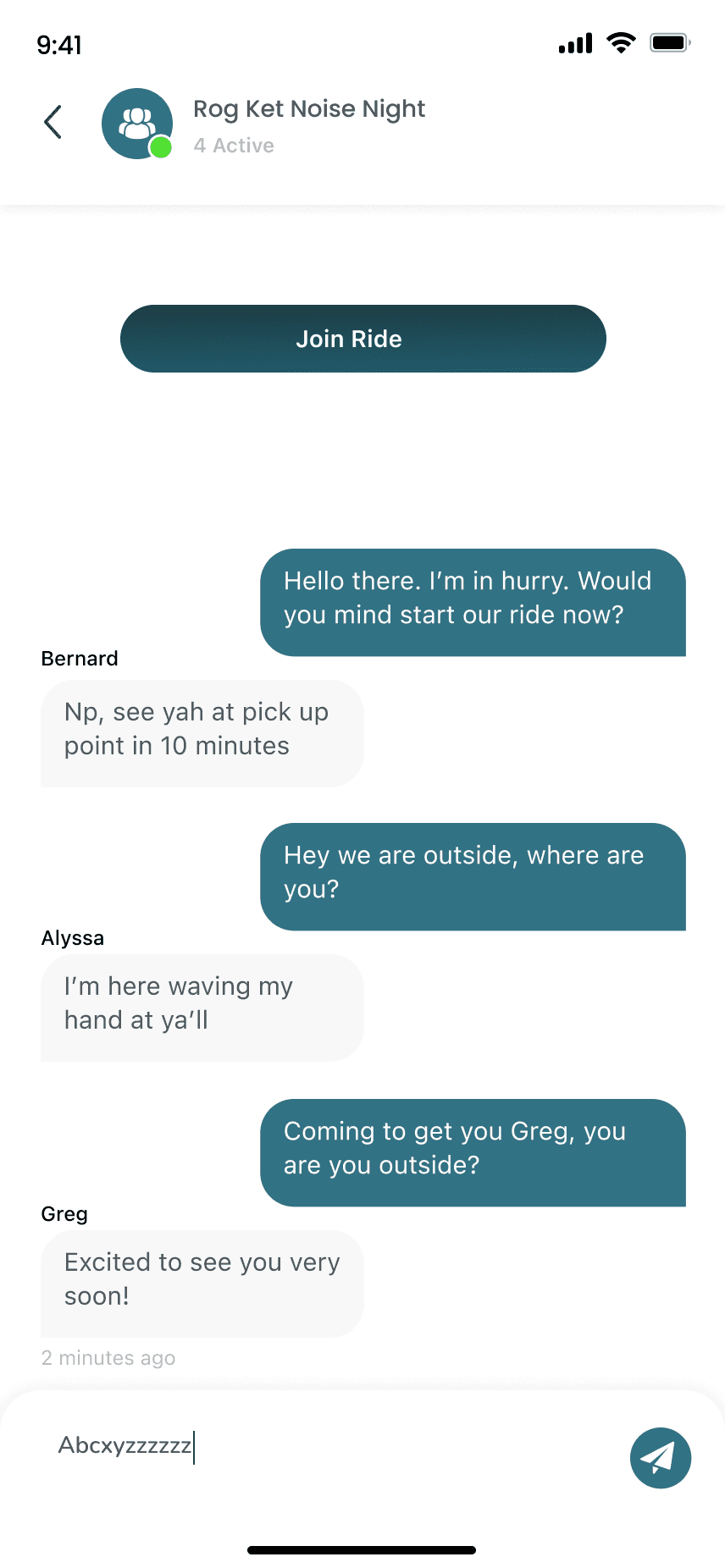
When offering or requesting a ride, users are prompted to join a carpool group for a specific event or destination by setting the date and time. If interested in a group they can request to join the group, and once they are accepted into the group they will be able to meet and communicate with the riders in the group.
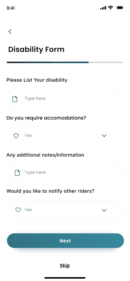
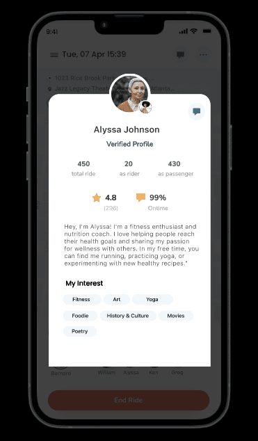
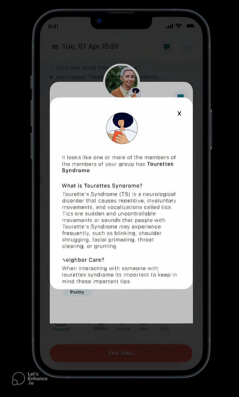
To achieve this goal of accessibility and inclusivity we created a disability icon feature that allows the disabled community to disclose their condition and allow non disabled people to learn and respect those with disabilities. We succeeded this through having an optional disability disclosure form in the onboarding process of RideX. This feature enables users to disclose their disability and select an associated icon to show other users that they have a disability. The user has the option to display or not display this icon on their profile however when matching with other users the icon will appear and alert fellow riders that the individual has a disability and the rider can click on the icon to learn information about the condition, as well as guidelines for interacting with the rider in a respectful manner.
Disability Disclosure Form
Profile with Disability Icon
Disability Description Box
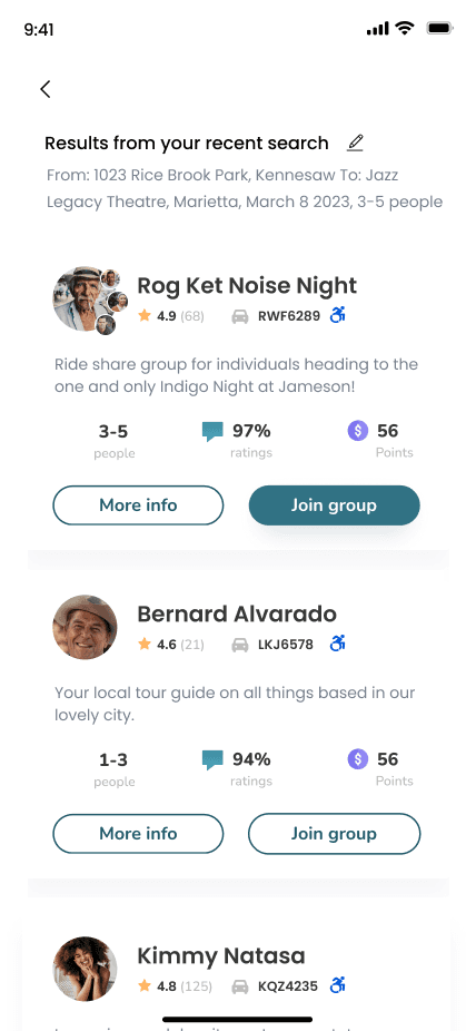
Event Group Matches
Event Group Chat
Problem Statement
The current state of ride share apps does not cater to a diverse range of users and is primarily focused on making money. Some ride share apps do have safety features and implement disability access.The social aspect of ride share which includes socializing with other ride share users and teaching users how to interact with disabled users. users should be able to have accessible and safe ride share while also making meaningful connections with other passengers/users. By giving users a platform to input their destination and find other users going to the same destination as them.
Refinement
Once Frameworks was complete our team moved on to the refinement phase of GDD. During the refinement phase we made sure to fix any errors, and imperfections to make sure that usability was flawless and met users goals. We conducted 2 usability test with 2 participants. Usability Testing is a observational method that allows designers to test products with real users to identify problems, and opportunities in designs to improve the final product.
Feedback from users:
Back button was not very useful and was confusing
-Payment confirmation was confusing and the pathway did not make sense
Improvements based on feedback:
Substituted back button with hamburger menu for easier navigation for certain screens
Reworked the payment confirmation pathway to be easier for the user
Redesigned the home menu to be more visually appealing.
Lessons and Takeaways
Our team did an amazing job executing and producing a user centered app through the GDD method.Each team member contributed in all phases of GDD design degigently and thoroughly while allows putting the user first. Some takeaways and lessons that I learned during this project are:
Having a wide range of user participants for user interviews gives alot of insights and provided many different point of views of user goals and considerations.
Accessibility within UX and Product Design is becoming more common and truly taking the time to research and talk to the disabled community is important in order to make sure products are usable for marginalized groups.
This project helped me grow as a designer, and researcher. I feel confident to continue to grow and work in more team projects to create user friendly products.
